 Home Factors
Email marketers need to consider how and where an email will be viewed, when it will be relevant, what action will need to be taken, and on what device?
Although there is no single template that works across all platforms or devices optimally, your email design can be optimized to satisfy the needs of the large screen user and the mobile user in one single design.
Here are mobile-friendly email design guidelines to ensure your message is accessible and optimized for smaller screens.
8 Best Practices for Mobile-Friendly Email Design
1. Adopt a Mobile-First Strategy
Think about how people actually read their emails today: 62% of email opens occur on mobile.
Instead of forcing a desktop design to shrink down, start with mobile in mind. Build layouts that can flex and scale automatically to fit any screen.
For average desktop computers, it is recommended that conventional emails be set up with a fixed width between 500-700 pixels. Most marketing emails and newsletters are designed to that specification.
However, mobile email readers vary in size and resolution.
2. Using Links
Links drive action, but on mobile they can quickly become a pain point if not handled thoughtfully. Make it easy for someone reading your message on a small screen to read, tap, and act.
A cluttered email with links jammed together makes it hard for readers to tap the right one—and nothing kills engagement faster than frustration.
Email link best practices:
- Avoid stacking multiple links too close together, because fingers aren’t as precise as a desktop mouse click. It’s important to give each link room to breathe.
- Add padding. You should use at least 10px of space around clickable areas (see Tip #5) so users can tap confidently without hitting the wrong link.
- Prioritize the quality of your links, over quantity. Include only the most relevant links that support your email’s goal.
- Make sure every link is secure and clearly labeled because mobile users can’t hover to preview a URL. Instead of “Click here,” use descriptive text like “View the full offer” or “Shop the collection.”
3. Effectively Use Subject Lines with visible or hidden Pre-Header-text
Your preheader is the snippet of text that appears right after the subject line in the inbox preview.
There are two schools of thought on preheaders:
A. Keep it short and visible, with one or two lines that complement your subject line.
B. Hide it in the code, so it shows in the inbox preview but doesn’t take up space in the email itself.
Either way, it’s prime real estate. You should use it to reinforce your subject line and give readers a reason to open.
- Ensure that the subject line and pre-header text are working to support each other. They’re the first impression your email makes. On mobile, that impression happens fast, so every character counts.
- Start with a short and sweet subject line, ideally 4–7 words or 30–50 characters. This ensures it fits neatly on smaller screens without getting cut off. Think of it as your headline.
- Instead of filler like “Click here if you can’t see images”, highlight your offer or tease the value inside, for example “Exclusive 20% off—today only” or “Your personalized guide is inside.”
4. Use a Single-Column Ladder Design
While Multi-Column designs are the gold standard for desktop creative since you have two separate larger areas to feature your best offer copy so that it appears at the top of the email preview pane where it’s more likely to be noticed.
This is known as the “above-the-fold” area and is commonly where your headline appears.
However, unresponsive code on a mobile device will likely shift the columns, text, images and create overlapping areas which is clearly a poor presentation. The single-column design with responsive code can maintain your clear offerings and content in any presentation format.
As long as you are using modern responsive coding, you can get away with 2 column or even 3 column designs. If done correctly they can stack cleanly on smaller screens, but that will require planning and forethought in your design.
Sometimes planning in reverse can serve you better. Design your email for mobile and determine how you want it to expand on larger screens.
5. Make CTAs Thumb-Friendly
Anticipate how fingers will navigate the clickable areas of an email on a touch screen. This would mean buttons and icons need to be larger, and the surrounding areas need to be more padded to accommodate fingertips in motion.
Allow for 10 pixels (give or take) around or in between any clickable area to leave space and make it easy for users to navigate and click to take action.
Also, allow for about 20-30 pixels around the border of the email for fingers to hold the tablet device. You don’t want key information hidden under the user’s thumb.
6. Selecting Readable Font Sizes
Another design tip is to use a minimum font size of 16-18px for body copy and a maximum headline size around 26-28px.
Any larger and you risk your email landing in the junk folder for desktop since some filters flag larger fonts used in email as spam or visual rendering issues and awkward word wrapping can happen.
7. Dark Mode Optimization
Dark mode is a user preference that’s become increasingly popular.
Millions of people now default to dark mode on their devices, and if your email isn’t optimized for it, your beautiful design could look broken or unreadable.
Make sure that you test your emails in both light and dark settings, use transparent PNGs, and make sure text and buttons have enough contrast to stay legible.
8. Calls to Action, Images and Alt Tags
Always use call to action buttons or icons because they are proven to increase response. Fingers cover about 45 pixels so design your buttons accordingly, then pad by 10 pixels.
Place those CTA icons in the top 250 pixels of the email (area above-the-fold) so they are easily seen and noticed by the user.
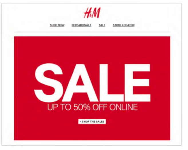
Image-to-text ratio is another factor to contend with when dealing with spam filters. Avoid slow email loading times by compressing images to under 200kb and limiting the use of large, animated GIFs (aim for under 1mb each). Keep it as simple as possible.
Header banners are the most common image to appear in an email, and they run across the very top. They illustrate a brand, an offer, or theme depending on the graphics used.
Alt tags are snippets of text associated with an image and are commonly used in email so that before an image loads, the user has an idea of what the image is, what the offer might be, or the overall theme of the email- so keep it short.
Importance of Landing Pages
Your email is the ‘teaser’ promotion that entices the consumer to click through to a landing page where more detailed ‘sell’ information is presented.
There are two types of landing pages, reference and transactional:
- A reference landing page presents information that is relevant to the email. These can display text, images, various links to company website, etc.
- A transactional landing page persuades a user to complete a transaction (such as filling out an order form), with the end goal of closing or converting a prospect into a customer. If information is to be captured, the page will usually capture some minimal amount of information (i.e. an email address, name and telephone number) – and adds the prospect to a mailing list.
Here are some points to consider when developing an effective landing page:
- On average, 50% of responders who click through to a landing page leave the page. Make sure your page grabs attention quickly by restating the offer/call to action from the email.
- Do not direct responders to your home page. This approach does not carry through the offer/call to action from the email – losing credibility.
- Make sure your landing page has the same look and feel of the email HTML creative. This ensures there is no confusion and reinforces the brand.
- If your landing page is a form to be completed, do not ask too many questions. Three to five fields are recommended.
- Keep the copy on the landing page short and to the point, but use as much space as you need to convey your message and land the sale.
- Always test call-to-action text on landing pages to boost conversion.
- Add social media integration on landing pages to boost customer confidence in your brand.